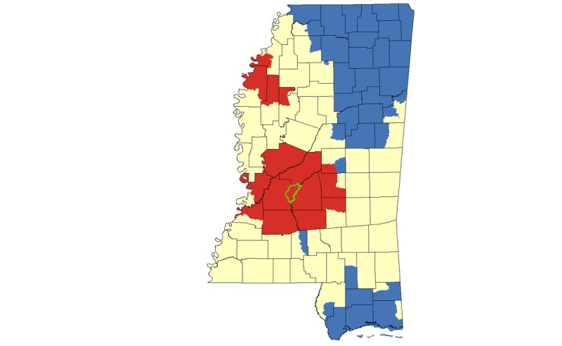
Figure 4.

Hotspot cluster map for HIV rates per 100,000 population in Mississippi, 2008-2014. Clusters are based on HIV rates aggregated at the census tract level. Census tracts with elevated HIV rates (red) represent hotspots (P<.05); census tracts with low HIV rates (blue) represent coldspots (P<.05); census tracts with mean HIV rates are represented in yellow. The Jackson Metropolitan Area is outlined in green.
