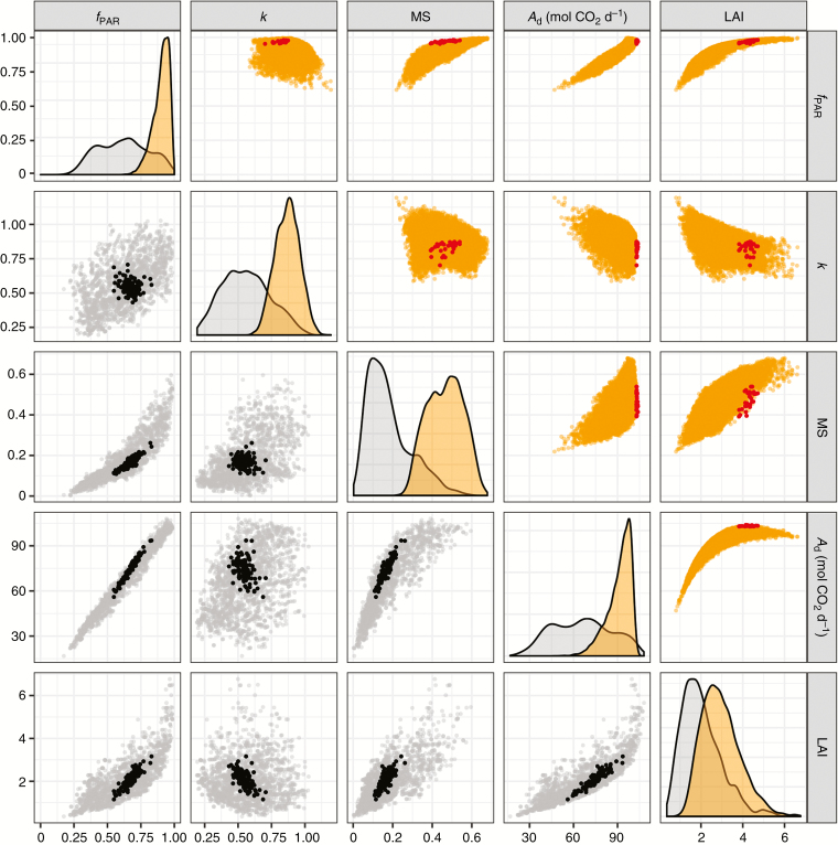
Fig. 4.
Scatter plots of model output variables estimated from the simulations generated in the Morris method (bottom left plots; grey points) and the metamodelling approach (top right plots; orange points). Plots on the diagonal represent the density plot of output variables (grey: Morris simulations; orange: metamodel simulations). Black points represent the outputs estimated for the 100 representative mock-ups and red points represent the outputs estimated for the 30 mock-ups with the highest values of Ad.

