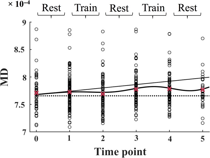
Figure 2.
The MD values for each subject (total n = 107) are plotted separately at each time point. The slope is displayed as a solid line, and the mean values across all subjects are displayed as red crosses. The full model is displayed as a solid curved line. The dotted line marks the intercept of the model at time point 0. The data is modeled according to Equation 1 (see Materials and Methods). MD = mean diffusivity.

