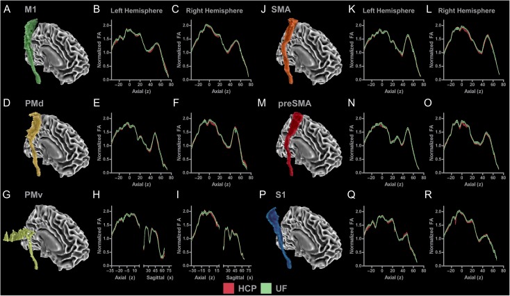
Figure 7.
Mean normalized FA profiles for each tract for each hemisphere for data collected as part of the Human Connectome Project and data collected at the University of Florida (UF). (A) M1 tract in the right hemisphere. (B) Slice-by-slice profile of normalized FA values in M1 tract in the left hemisphere. (C) Slice-by-slice profile of normalized FA values in M1 tract in the right hemisphere. HCP data are represented with black lines and red shading (mean ± SEM). UF data are represented with black lines and green shading (mean ± SEM). HCP and UF profiles show a similar pattern in the M1 tract across group and hemisphere. Profiles were created for each of the 5 remaining sensorimotor tracts in both hemispheres and are shown in Figures (D–R).

