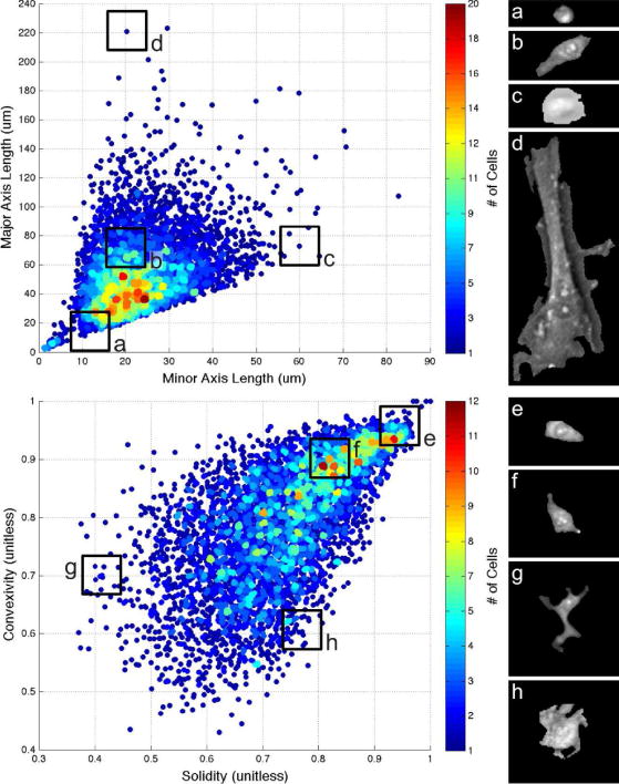
Fig. 8.

Range and density of segmented cell morphologies. Top heat map plots major vs. minor axis length, quantifying how round or slender cells appear. Bottom heat map plots convexity vs. solidity, quantifying perimeter energy and how spread out each cell is. Each heat map is accompanied by four example cells representing morphologies of different areas of the map. Data shown includes one image from each of our data sets, totaling over 5,000 cells.
