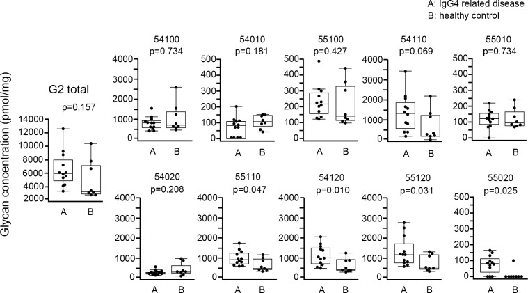
Fig 6. Comparison of absolute concentration of IgG4 G2 glycans between IgG4RD and healthy controls.
Data are shown as box plots. The boxes indicate the upper and lower interquartile range (IQR), the lines within the boxes indicate the median, and the whiskers indicate the minimum and maximum IQR. Each dot represents an individual sample. Statistical analysis was performed using the Mann-Whitney U-test.

