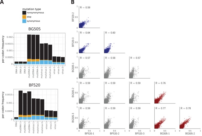
Figure 3. The deep mutational scanning selects for functional Envs and yields measurements that are well correlated among replicates.
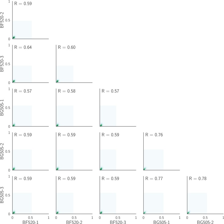
(A) The average per-codon mutation frequency when sequencing plasmids encoding wildtype Env (DNA), plasmid mutant libraries (mutDNA), mutant viruses after the final infection (mutvirus), and virus generated from wild-type plasmids (virus). Mutations are categorized as nonsynonymous, synonymous, or stop codon. The DNA samples show that sequencing errors are rare, and the virus samples show that viral-replication errors are well below the frequency of mutations in the mutDNA samples. Comparing the mutvirus to mutDNA shows clear purifying selection against stop codons and some nonsynonymous mutations, particularly after subtracting the background error rates given by the virus and DNA samples (Figure 3—source data 2). More extensive plots from the analysis of the deep sequencing data are in Supplementary file 1 and 2. (B) Correlations between replicates in the measured preferences of each site in Env for all 20 amino acids. Blue indicates replicate measurements on BF520, red indicates replicate measurements on BG505, and gray indicates across-Env measurements of BF520 versus BG505. is the Pearson correlation coefficient. The numerical values for the preferences are in Figure 3—source data 2. Figure 3—figure supplement 1 shows the correlations using contour rather than scatter plots.


