Figure 1.

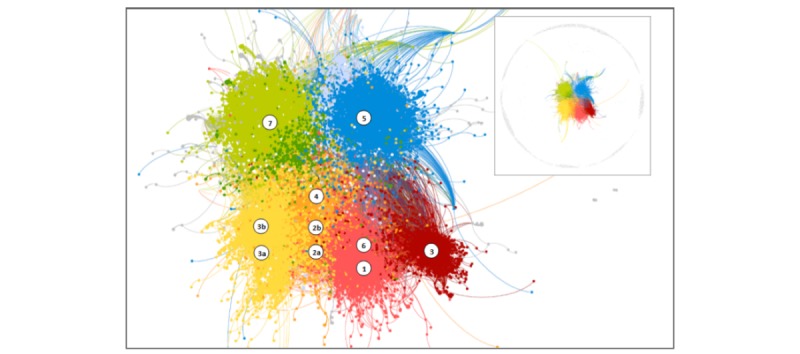
Network diagram illustrating user engagement with each post. Colors represent modularity clusters. Numbered symbols represent each Facebook page with the location indicating the modularity class in which most posts were located.

Network diagram illustrating user engagement with each post. Colors represent modularity clusters. Numbered symbols represent each Facebook page with the location indicating the modularity class in which most posts were located.