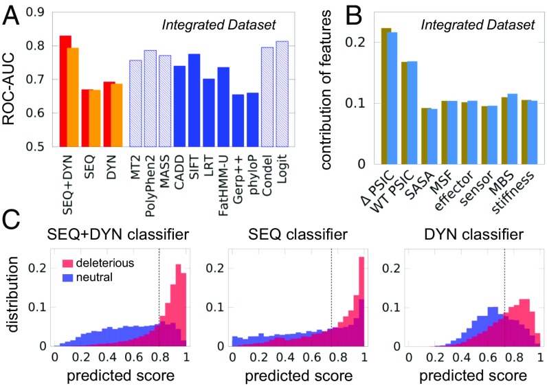
Fig. 2.
Performance of pathogenicity prediction tools tested against the Integrated Dataset. (A) The 10-fold cross-validated accuracy measure for the three RF classifiers (red bars) is compared with those of other predictors (blue bars). Dashed blue bars refer to cases possibly affected by training bias; orange bars describe analogous results after excluding same-site variants from training and test sets. See SI Appendix, Fig. S4 for additional comparisons, and SI Appendix, Table S3 for the results from additional performance metrics. (B) Feature importance plot for the SEQ+DYN classification (tan bars). Blue bars correspond to orange bars in A. (C) Distribution of predicted scores for neutral (shown in blue) and deleterious (shown in red) variants in the Integrated Dataset, for the three classifiers. The dashed vertical line represents the cutoff based on Youden’s index. CADD, Combined Annotation Dependent Depletion; LRT, likelihood ratio test; MASS, Mutation Assessor; MT2, Mutation Taster-2.

