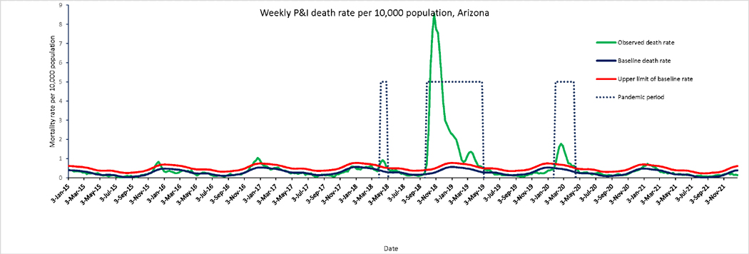
Figure 1.
Weekly time series of P&I death rates per 10,000 population in Arizona, 1915–1921. The green line is the weekly P&I death rates. Dotted lines highlight pandemic waves. The Serfling seasonal regression model baseline (blue curve) and corresponding upper limit of the 95% confidence interval of the baseline (red curve) are also shown.

