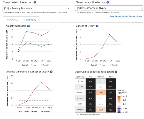
Figure 1.

Screenshot of the “Prevalence” tab for anxiety disorders, cancer of the ovary, and the dyad consisting of anxiety disorders and cancer of the ovary in the Rochester Epidemiology Project Data Exploration Portal.

Screenshot of the “Prevalence” tab for anxiety disorders, cancer of the ovary, and the dyad consisting of anxiety disorders and cancer of the ovary in the Rochester Epidemiology Project Data Exploration Portal.