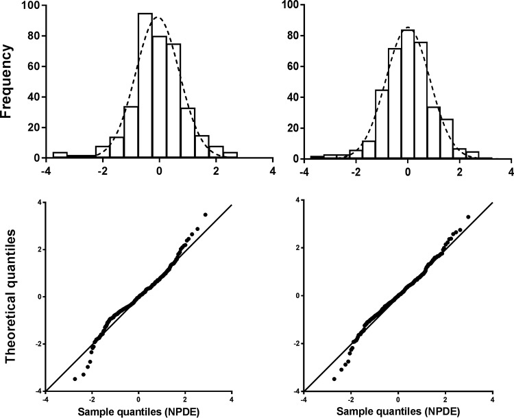
FIG 3.
Histogram of the NPDE distribution (upper portion) versus the theoretical N(0,1) distribution (dashed line) and quantile-quantile plot (lower portion) of the metrics based on observations (black dots) versus the theoretical N(0,1) distribution (black line) of the system-specific model (left) and the reference model (right).

