
Fig. 2.
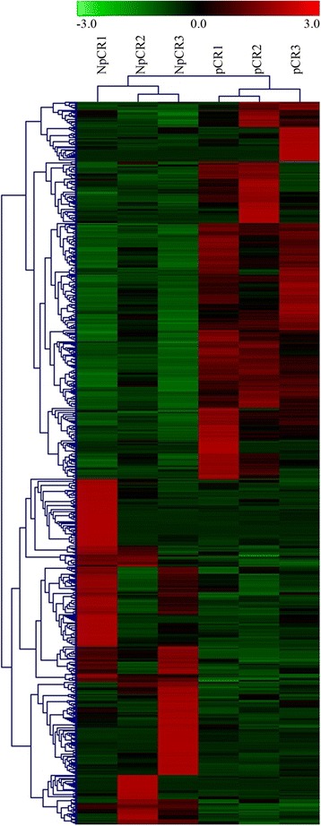
Cluster analysis of gene expression based on digital gene expression sequencing (DGE-seq) data. The heat map reveals the results from the cluster analysis of the DGE-seq data. Each column represents one of the 715 differentially expressed genes identified in our study. Each row represents a sample. For each gene, red indicates a high level of expression relative to the mean, whereas green indicates a low level. The scale bar below indicates the number of standard deviations from the mean