Fig. 2.

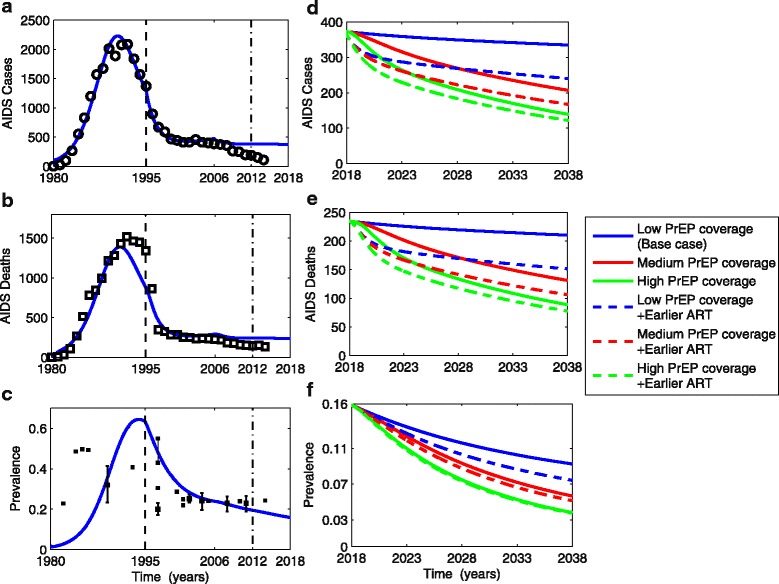
Model fit (blue lines) to observed AIDS incidence (black circles in a), AIDS deaths (black hollow squares in b) in a San Francisco MSM cohort. c Comparing model-generated prevalence with observed HIV prevalence data among sampled MSM populations (black solid squares and 95% confidence interval if available). Dashed vertical black line divides the pre-treatment and post-treatment phases of our model, roughly approximating the increase in ART availability post-1995 in San Francisco. Dot-dashed vertical black lines show rollout of low coverage PrEP starting in 2012. AIDS cases (d), deaths (e), and prevalence (f) are projected for different PrEP coverage levels, with or without earlier ART (as shown in Fig. 1b) over the next 20 years (2018–2038) with the Y-axis rescaled relative to the left panels to clarify the differences between scenarios (blue lines in left and right panels correspond). PrEP pre-exposure prophylaxis, ART antiretroviral therapy, MSM men who have sex with men
