Fig. 1.
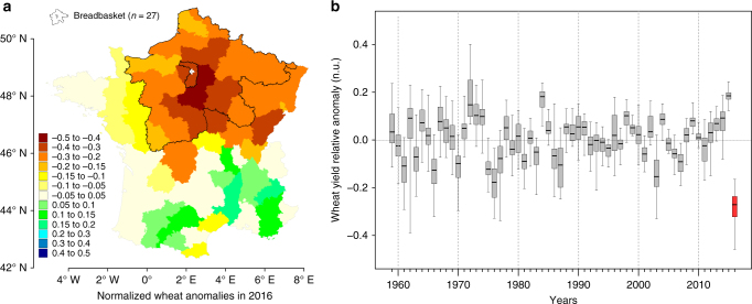
Spatio-temporal pattern of the 2016 extreme yield loss. a Wheat yield anomalies in 2016 relative to expected values defined in each department by the long-term yield trend (e.g., −0.1 corresponds to a loss of 10% compared to expectation, see Methods). The breadbasket region of France is delineated in bold black contours. Note that a similar figure is presented for each year in the data set in the Supplementary Movie 1. The map was generated with R based on the yield data used in the analyses. b Boxplot of the distribution of anomalies in the breadbasket (1959–2016). Decades are separated with thin dotted lines. Anomalies in 2016 are highlighted in red. Yearly median anomalies are presented in Supplementary Fig. 1b

