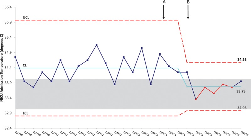
Fig. 4.

Statistical Process Control chart demonstrates 7 successive points below the baseline mean during the postintervention period, indicating special cause. Implementation of interventions including education of using the last transport temperature as the NICU admission temperature (A) and implementation of active cooling (B) are marked. The solid line represents the baseline average and dotted lines represent the control limits while the grayed box outlines the target temperature of 33–34°C. CL, Control Limit; LCL, Lower Control Limit; QY, Quarter/Year; UCL, Upper Control Limit.
