Fig. 7.
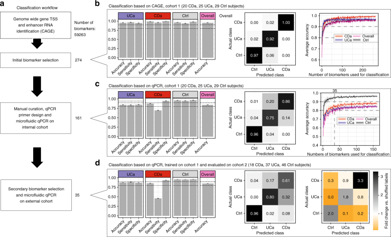
Classification of UC, CD, and controls. a Overview of analyses. Starting from all TSSs and enhancers (referred to as biomarkers, N = 59,263) in cohort 1, we performed an initial feature selection using an ensemble approach, resulting in 274 features. We designed successful qPCR primer pairs for 161 biomarkers and applied microfluidic qPCR analysis to the same samples. A secondary feature selection process was used to reduce the set of biomarkers to 35. We analyzed the expression of these biomarkers in an independent validation cohort (cohort 2) using microfluidic qPCR. Classification analysis was performed at each step (panels b–d). b Prediction of UCa/CDa/Ctrl diagnosis labels based on CAGE expression. CAGE expression data from cohort 1 from 274 selected biomarkers were used to train and evaluate a Random Forest model based on five-fold cross-validation 1000 times. Left panel: average accuracy, sensitivity, and specificity are shown for each subject group as bar plots along with overall accuracy. Error bars show 95% confidence intervals across cross-validations. Dotted lines indicate 0.8 and 0.9. Middle panel: confusion matrix showing average fractions of predictions that fall into each of the actual subject groups (columns add to 100%). Right panel: average prediction accuracy (Y-axis) as a function of number of biomarkers used for training (X-axis). Shaded areas indicate 95% confidence intervals across cross-validations. c Prediction of UCa/CDa/Ctrl diagnosis labels based on microfluidic qPCR expression. Plots are organized as in panel b, but based on microfluidic qPCR expression data from cohort 1 using 161 primers corresponding to selected biomarkers. d Validation using an independent cohort feature reduction based on the data in panel c resulted in the selection of 35 features. We trained a Random Forest model on microfluidic qPCR data from these biomarkers from cohort 1 and evaluated it on corresponding data from an independent cohort (cohort 2). Left and middle panels show classification results, as in panel b. Right panel shows a comparison between the confusion matrix (as in panel b) of our predictions and the confusion matrix obtained by repeating the analysis with randomly shuffled training labels. Numbers indicate the average fold changes of fractions (actual vs. shuffled)

