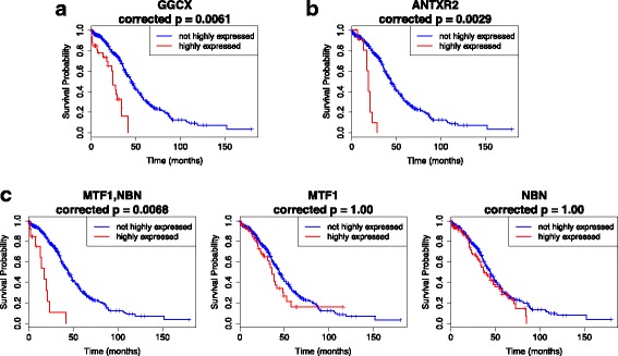
Fig. 4.

Kaplan-Meier plots for the top three markers in Table 3, and the corresponding KM plots for the individual genes in combination markers. In the combinations, all genes involved are assumed to have high expressions. For all figures, the red curves represent the survival probability of individuals with highly expressed genes/gene combinations, while the blue curves represent the survival probability of individuals with non-highly expressed genes/gene combinations. Indicated p-values are the adjusted log-rank p-values using the total correction factor k=920351. If the adjusted p-values exceed 1.0, p=1.0 is used. a The KM plot for the single gene GGCX, which is the top marker in Table 3 (most number of occurrences); b The KM plot for the single gene ANTXR2, the third marker with most number of occurrences; c The KM plot for the 2-gene combination MTF1,NBN (left-most), and the respective plots for the individual genes
