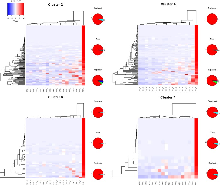
Fig 5. Heat maps of four of the five idiosyncratic clusters of genes indicated in Fig 3B.
The pie charts on the right of each heat map represent the frequencies of feeding treatment (top), time (center) and replicate number (bottom) of the contig producing the highest RPKM value. The color key represents the color code of the Z scores.

