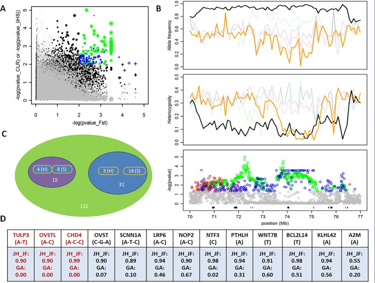
Fig 4. Highlight of a candidate selection region on GGA 1 in JH_JF.
(A) Distribution of log10 (PCLR or P|iHS|) and log10 (PFST) values calculated in sliding windows. The dots of color (corresponding to signals surpassing the 5% significance threshold of the empirical log10 (PCLR or P|iHS|) and signals surpassing the 5% significance threshold of the empirical log10 (PFST) distribution) are genomic regions underlying artificial selection in JH_JF. The dots in green represent the significant signals located in this candidate selection region. (B) The bottom Manhattan plot shows all selection signals identified by CLR (the dots in green) and FST (the dots in blue) in the 70–77 Mb region of GGA1, respectively. The positions of 131 gene models in this region are displayed by the black segments. The middle plot shows the pattern of heterozygosity of four domestic populations in this region. The top plot shows the major allele frequencies in JH_JF and their corresponding frequencies in three other domestic populations in this region. The lines in black, orange, green, red and blue separately represents JH_JF, GA, PB, RH_WL and AR_VO. (C) Classification of 15 genes with multiple makers and 31 genes with single marker. H and S indicate hard sweep and soft sweep, respectively. (D) 13 genes and their core haplotype frequencies (or major allele) in JH_JF (Obs.) and GA (Ref.), See Supplementary S4 Table for the exact nucleotide positions.

