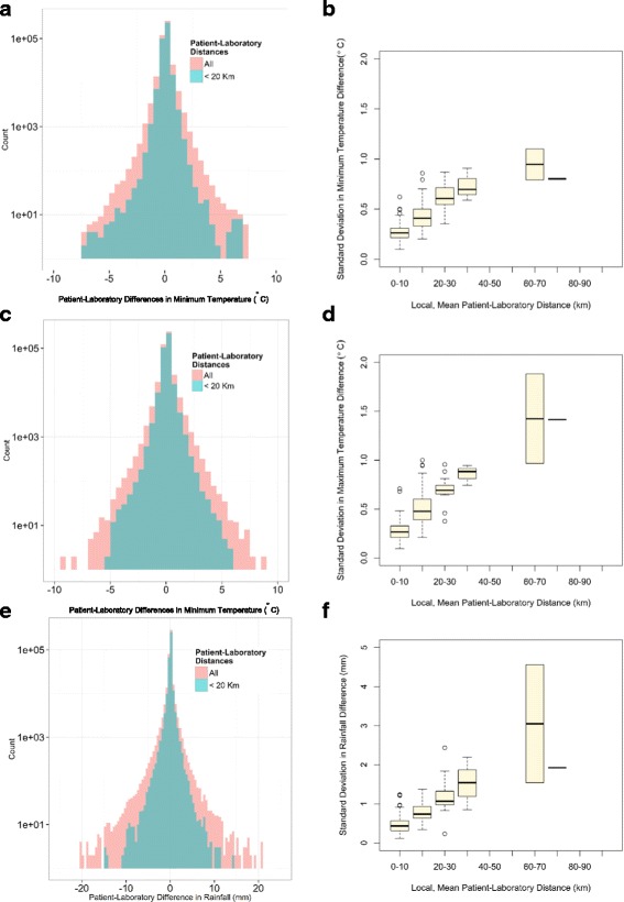
Fig. 4.

Impact of patient-laboratory distances. Panels a, c and e: Histogram showing the distributions of the differences in minimum temperature, maximum temperature and rainfall registered at the laboratory and patient residence addresses. The blue histograms correspond to the subset of cases when the patient-laboratory distances are lower than 20 km. Panels b, d and f: the x-axis represents the local mean patient-laboratory distances (for visual purposes the continuous values were converted into a discrete bins); the y-axis is standard deviation in minimum temperature, maximum temperature and rainfall differences registered at these addresses
