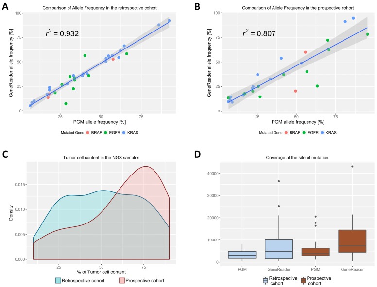
Figure 1.
Correlation of the allele frequency for all mutations found between the GeneReader and the Ion PGM in the (A) retrospective and the (B) prospective cohort. The Pearson’s correlation is indicated on the graphs. The 95% confidence interval is represented as hatched grey areas. The different underlying mutations are indicated by differently colored dots on the plot; (C) Density plot of tumor-cell content distribution between the retrospective (in blue) and prospective cohort (in red); (D) Coverage at the site of mutation in the respective genes for the GeneReader and the Ion PGM. Median with the first and third quartile is blotted in the boxes, prolonged with the 1.5× interquartile range. Outliers outside of this range are indicated as dots.

