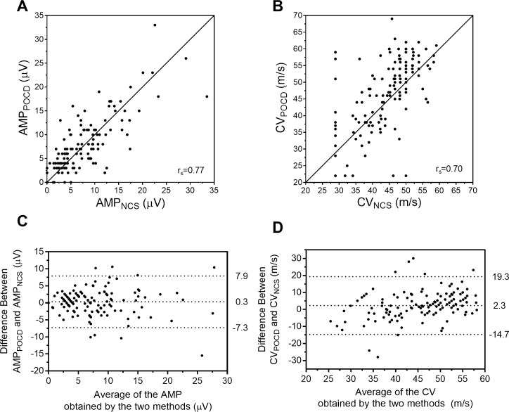
Fig 2.
Scatterplots (A, B) and Bland-Altman plots (C, D) for comparison of AMP and CV as determined by POCD and standard NCS. Panels A and B display the scatterplot of AMP (A) and CV (B) obtained by the two methods, rs refers to Spearman’s rank correlation coefficient, and the solid diagonal line represents the line of unity (x = y). Panels C and D display the Bland-Altman plots demonstrating the difference between AMPPOCD−AMPNCS (C) and CVPOCD−CVNCS (D); points above or below zero on the y-axis represent overestimation and underestimation by the POCD, respectively. The dotted lines (C, D) correspond to, from top to bottom, the 97.5th percentile of differences, the mean difference, and the 2.5th percentile of differences.

