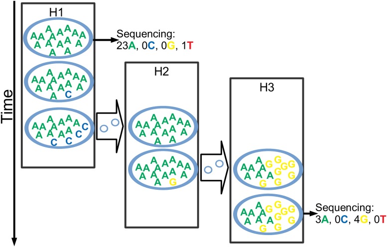
Fig 2. Graphical representation of the transmission, evolution and sequencing model.
Here we describe some key aspects of our model. The figure depicts a possible evolutionary outcome for one position of the pathogen genome and the given transmission history. There are three hosts in this outbreak, represented by the black rectangles: H1 infects H2, which in turn infects H3. Time is on the vertical axis, and transmission events are represented by the thick arrows between hosts. Within each host, while it is colonised, the pathogen population consists of 15 units, each of which can have one of the four nucleotides at the considered position and at any time. For example, H1 starts off with all 15 pathogen units having an A, but during infection one of them mutates to C, and through genetic drift when H1 infects H2 it has 4 C’s and 11 A’s. While instantaneously only small changes can occur (one pathogen unit changing its nucleotide), along a time interval any number of changes can occur. As H2 is infected by H1, H2 is colonised by a copy of the pathogen population of H1, but the transmission bottleneck in this case causes one of the nucleotides to be lost, so that H2 is founded by a homogenous population of A’s. Within H2 again a mutation occurs and now a G is present in the pathogen population, but when H3 is colonised by H2 both nucleotides survive the transmission bottleneck, so H3 starts off with a polymorphic population. In the figure, H1 and H3 both have samples extracted and sequenced once, while H2 is not sampled at all. The sequencing process can result in any coverage (24 for H1 and 7 for H3 at the considered position). Furthermore, the observed nucleotide frequencies don’t necessarily exactly match the real nucleotides frequencies due to the randomness of read sampling, and because sequencing error can cause absent nucleotides to be observed at very low frequencies.

