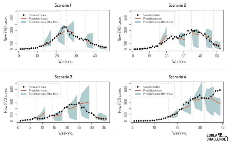
Figure 1.
Example of ensemble prediction graph provided to participants throughout the challenge. Here for prediction time point 5. The grey area represents the cone of incidence predictions 1–4 weeks ahead (min and max across all teams) while the red line is the mean. The black dotted line represents the synthetic epidemic curve.

