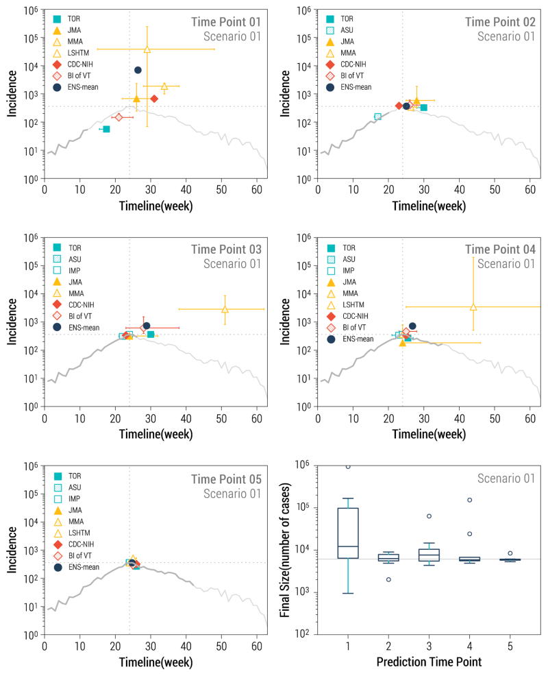
Figure 3.
Longer-term prediction targets for data-rich scenario 1. The first 5 panels represent the timing and magnitude of predicted Ebola peaks by team and prediction time point. The grey curve represents the target outbreak incidence data, with dark grey representing the amount of data available for prediction at each time point, while the light gray curve displays the full outbreak. The bottom right panel represents the distribution of final size predictions across teams by prediction time point. The solid horizontal grey line marks the true final size of the outbreak in scenario 1.

