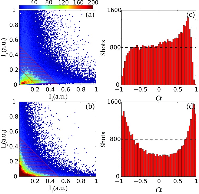
Figure 3.
(a, b) Two-dimensional cumulative histograms of  versus
 for two different operation configurations from 105 shots. The color bar indicates counts. (c, d) Corresponding distributions of pulse intensity asymmetry
  =
=  within the summed-pulse intensity regime as approximately illustrated by the dashed area, which corresponds to the
  signal level within the [0.22, 0.52] range as indicated by the red area in Fig. 2(c) ▸.

