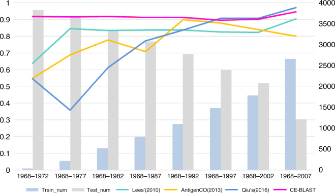
Fig. 2.
Performance comparison between CE-BLAST and peers on mutual HI data of 3867 HA pairs of influenza H3. The X axis represents different simulation time points with an increasing window of 5 years. Blue bars show the numbers of training data within the time period, whereas gray bars represent those remaining as testing data, with the corresponding values indicated on the right. Each colored line shows the performance (AUC value) of the computational model, corresponding to the value on the left

