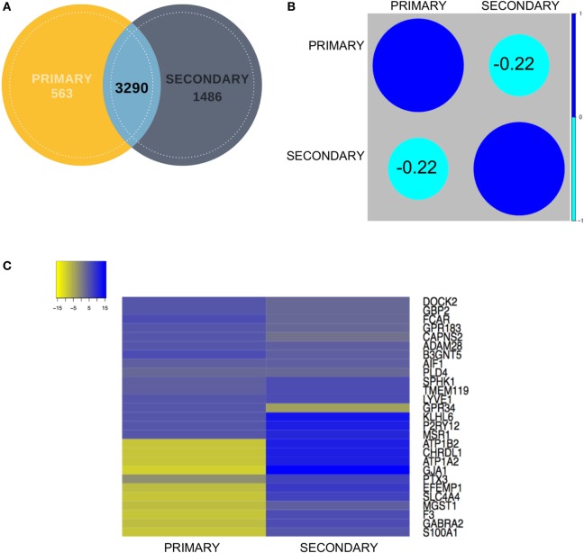
Figure 3.
(A) Venn diagram showing contribution of each dataset (primary and secondary) to the overlapping gene pool. (B) Correlation analysis between the primary and secondary datasets showed mildly negative correlation. (C) Representative expression heatmap between the final shortlisted 27 genes has been elaborated in the expression map for in-depth correlation analysis.

