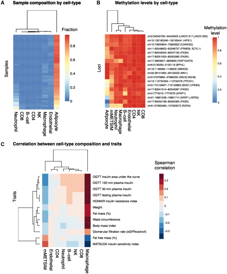
Figure 4.
Cell-type deconvolution. (A) Sample composition by cell type is shown for different cell types (columns), across all METSIM samples (rows). The color in the heatmap represents the relative fraction that each cell-type contributes to the total in each sample. (B) For each methylation locus (rows), the methylation levels in METSIM samples or for different cell types (columns) are shown in the heatmap, the color represents the methylation levels. (C) Correlation between cell-type composition and clinical trait. Traits are plotted in rows, and cell types are plotted in columns. The color in the heatmap represents Spearman correlation between the fractions derived from each cell type and a clinical trait for and an individual, across all individuals in the METSIM samples.

