
Fig. 5.
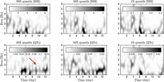
The spectrogram results of the first case for a comparison. Top: the spectrogram of different time series related to the RRI; bottom: the spectrogram of different time series related to the inverse of the QTc. Compared with the tvPS provided by ConceFT, the spectrogram is blurred and the pattern is less easy to identify. For example, the daily oscillation (indicated by the red arrow) after day 4 is very blurred