Figure 2.
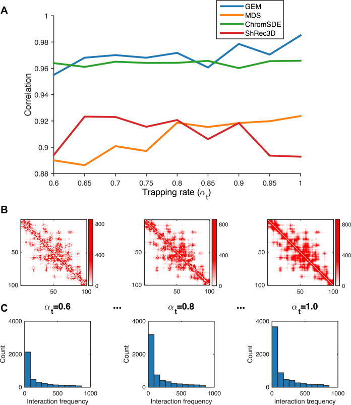
The validation results on the simulated Hi-C data, which were generated according to different settings of the trapping rate αt (see Supplementary Methods). (A) The comparisons of Pearson correlations between GEM and other modeling methods, including the MDS (29,30) based model, ChromSDE (17) and ShRec3D (18). (B and C) show the typical examples of the simulated Hi-C maps and the corresponding distributions of the simulated interaction frequencies as αt increases, respectively. In the simulated Hi-C maps, the axes denote the genomic loci (1 Mb resolution) and the values of the entries indicate the simulated interaction frequencies. In the histograms, the x axes denote the interaction frequencies obtained from the Hi-C maps and the y axes denote the numbers of data points falling into individual interaction frequency intervals.

