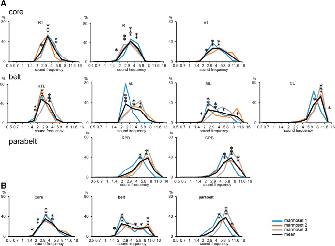
Figure 5.
Distribution of preferred sound frequencies in each auditory cortical area. A: relative areas with preference for sound frequencies of 0.5–0.7, 0.7–1, 1–1.4, 1.4–2, 2–2.9, 2.9–4, 4–5.8, 5.8–8, 8–11.6, and 11.6–16 kHz. B, Relative areas with preference for different sound frequencies in the core, belt, and parabelt regions. The pale blue, orange, and gray lines represent the three individual marmosets, and the black line represents the mean value for the three marmosets. The number of asterisks represent the number of animals with significantly biased representation in response to the sound frequency.

