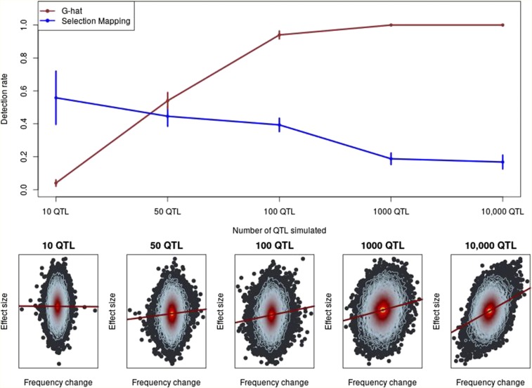
Figure 1.
The power of to identify selection. Top: The detection rate, or proportion of true positives, of compared to FST-based selection mapping. Vertical lines indicate 1 SD. SD for selection mapping were estimated empirically. SD for were estimated based on the binomial distribution. Bottom: Exemplary heat plots depicting individual SNP allelic effect estimates linearly regressed on allele-frequency change over time. Each point represents a SNP and the contour lines indicate the density of SNPs, with red contours indicating a greater density of points than blue. From the regression line, observe that a stronger relationship between frequency change and effect size corresponds to increasing polygenicity. G-hat,

