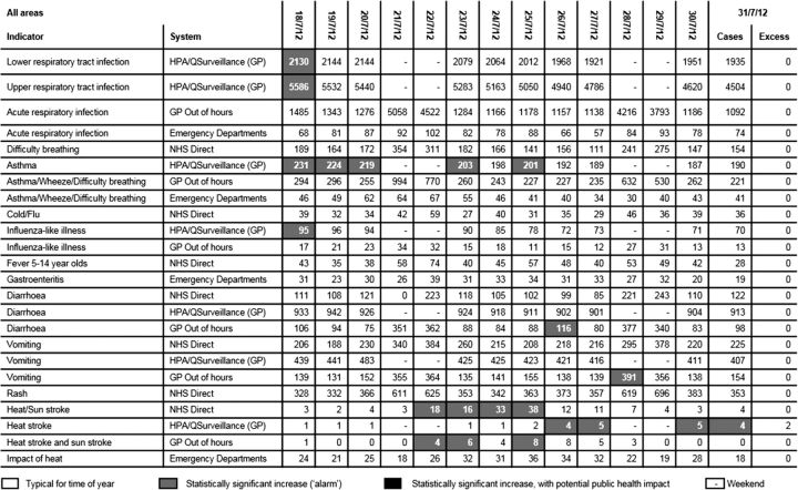
Fig. 2.
Syndromic signals overview table displaying signals, and the corresponding number of cases each day, for selected syndromes over a 14-day period. Signals were highlighted in green (shown as white here) if they were typical for the time of year, amber if there (shown as grey) was a statistically significant increase in activity ‘an alarm’ and red (shown as black) if there was considered to be a potential public health impact and ‘an alert is being issued’. Excess cases: - the number of cases above the upper threshold (shown for the last date in the date range only).

