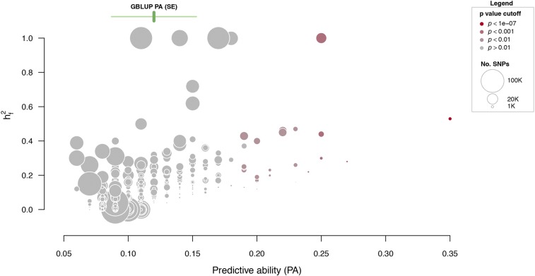
Figure 3.
Results from the GFBLUP models. Each point corresponds to one GO term that is plotted within the space of genomic variance explained () and predictive ability (PA). The size of each point relates to the number of SNPs within the GO term, and the color indicates the p-value of increased predictive ability compared to the GBLUP model. The mean predictive ability ± standard error (SE) of the GBLUP model is indicated with green vertical and horizontal lines, respectively.

