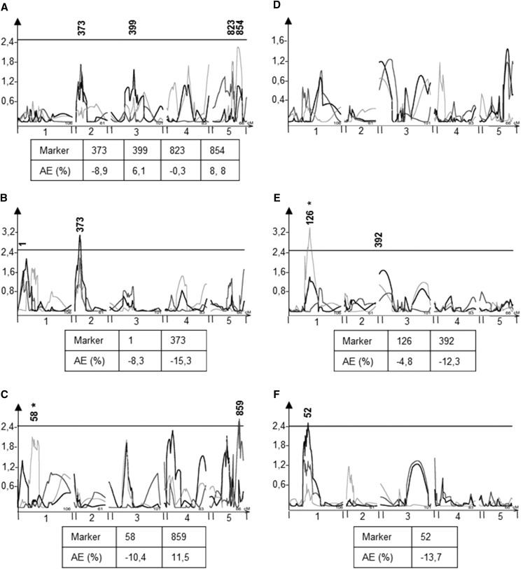
Figure 6.
EpiQTL mapping of glucosinolate mean and CV. Plots show composite interval mapping results and significance estimated from 1000 permutations. The x-axis shows the genome by chromosome and y-axis shows the LOD score. The significance thresholds are plotted for each trait and significant QTL are re marked with red arrows. The light gray line shows the QTL map using the means from experiment 1, dark gray shows experiment 2, and black lines represent the pooled data from experiment 1 and 2. Marker names show the position of significant makers after using a linear model to assess loci. EpiQTLs not assigned a marker were rejected in the subsequent ANOVA. An asterisk after a marker shows that the marker was not significant in both experiments. Beneath plots are shown the additive effect of markers, i.e., the percentage phenotypic change when the marker is ddm1 within the epiRIL lines compared to WT. A) Mean SC glucosinolate content, B) Mean LC glucosinolate content, C) Mean Indolic glucosinolate content, D) Within line CV for SC glucosinolates, E) Within line CV for LC glucosinolates, F) Within line CV for Indolic glucosinolates.

