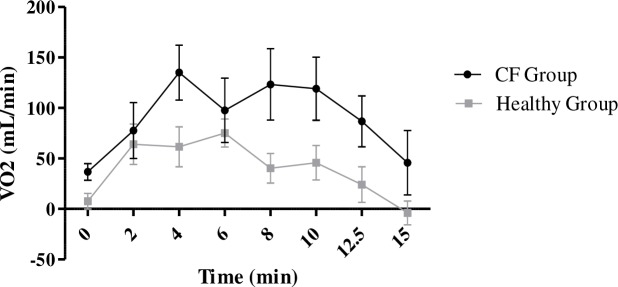
Fig 4. Comparison of the time-course of oxygen consumption with UB compared to NB between the CF and healthy groups.
Black circles and black lines represent the time-course of change in oxygen consumption between walking with the UB and walking with NB in the CF group. Grey circles and connecting lines represent the same changes in oxygen time course in the healthy group.

