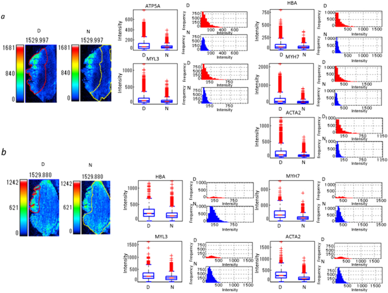
Figure 5.
Quantification of peptides in infarcted and healthy areas by ROI analysis. The box plot shows differences and the distribution of intensity of all pixels in a m/z image between infarcted and healthy area. Box plot: upper horizontal line of box, 75th percentile; lower horizontal line of box, 25th percentile; horizontal bar within box, median; upper horizontal bar outside box, 90th percentile; lower horizontal bar outside box, 10th percentile. The histogram shows differences and the frequency of intensity of all pixels of the m/z image between infarcted and healthy areas. The histogram vertical axes represent the frequency of pixels. The horizontal axes represent intensity. (a) Sample 1, (b) sample 2. The two photos on the left represent individual ROIs. The red lines demarcate the border of the ROI for the endocardial infarcted lesion (D) in the left side of the tissues and of the residual normal area (N) in the right side of intact area. The yellow lines demarcate the ROI of the healthy lesion.

