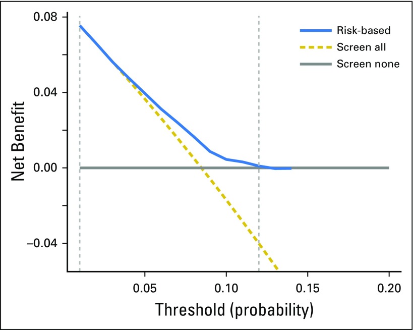
Fig 4.
Decision curve analysis for the risk model for second primary lung cancer. The x-axis is the risk threshold probability that changes from 0 to 1 (right truncated at 0.2) and the y-axis is the calculated net benefit for a given threshold probability. The blue curve depicts the net benefit of the risk model–based selection strategy for screening, whereas the gold and gray lines display the net benefits in the alternative strategies of screening all patients (gold) versus screening no patients (gray) in the data set.

