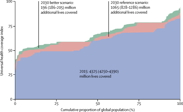
Figure 5.
Lives covered, 2015, and under the 2030 reference and 2030 better scenarios
On the horizontal axis, the global population is ordered by each country's UHC index rank. Similar to a concentration curve, each shift in the graph represents a country, with longer lines representing more populous countries. The area under the curve represents the share of the global population covered by UHC services. UHC=universal health coverage.

