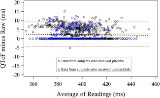
Figure 3.

Assessment of bias in QTcF measurements. Bland–Altman plot for the full analysis set comparing the semiautomated and fully‐automated QTcF measurements. Footnote: Red solid and dotted lines represent mean ± 2 standard deviations of the difference between the two measurement methods; green dashed line represents regression through the data using an M estimator as described by Ferber et al.22 [Color figure can be viewed at http://wileyonlinelibrary.com]
