
Figure 8. Correlation between RT and baseline activity in FEF.
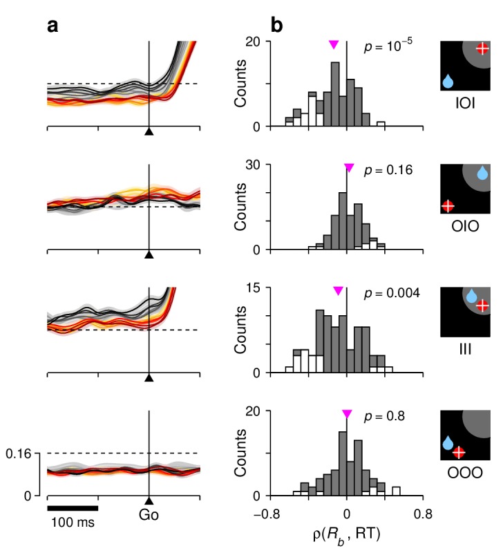
For each row, the corresponding target-reward-saccade configuration is depicted by the icon on the far right. (a) Normalized neural responses around the go signal. Each colored trace corresponds to population firing rate as a function of time for a subset of trials around a particular RT quantile. Traces are exactly as in Figure 7e–h (left panels), except at shorter x and y scales, as marked on the bottom panel. The dashed reference line is identical across panels. (b) Distributions of Spearman correlation coefficients between RT and baseline activity, . The data in each histogram are from the same cells used in Figure 7. White bars correspond to significant correlations (). Pink triangles mark mean values, with significance from signed-rank tests indicated.