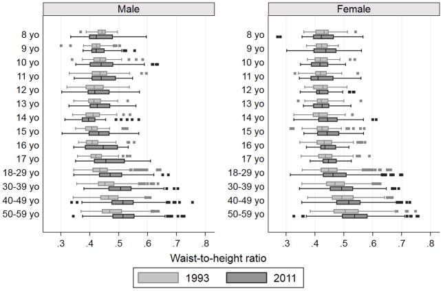
Figure 2.
Box plots of waist-to-height ratio shown by sex, age category and wave in China (1993 and 2011).
Each boxplot shows the median and 25th and 75th percentile values by given age-sex category. The upper adjacent value was defined as the largest figure less than or equal to the 75th percentile values + 1.5 × interquartile range (IQR) and the lower adjacent value was defined as the smallest figure more than or equal to the 25th percentile values −1.5 × IQR. Dots represent participants whose waist-to-height ratio did not fall between the two adjacent values.

