
Figure 2.
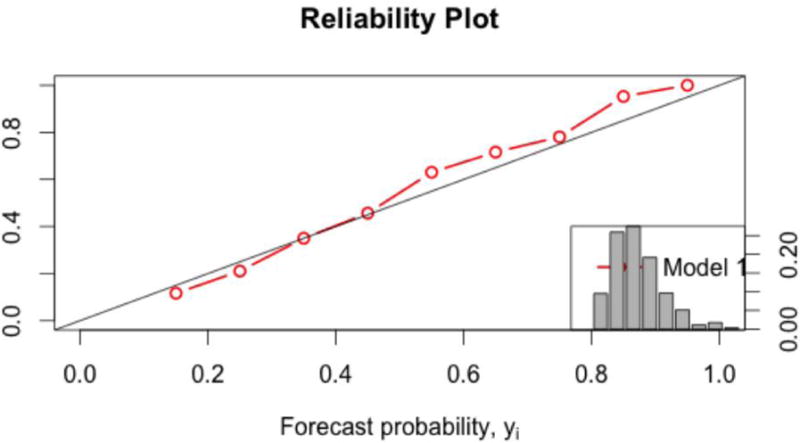
The calibration and resolution of the selected AIR model is displayed using a calibration plot (large plot) and the histogram (small plot). The similarity of the forecasted (x-axis) versus actual probabilities (y-axis) indicates a well-calibrated model, while the high frequency of forecasts near the base rate of the sample indicates that the model does not have a high degree of resolution.