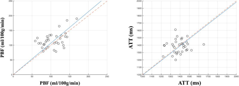
Figure 5.

Comparison of PBF (left plot) and ATT (right plot) acquired from two scans within the second trimester. Each dot in the plot represents PBF or ATT of a single subject while horizontal and vertical axes represent the data from the first (14–16 weeks) and second (19–22 weeks) scans respectively. Slope of the solid blue line was estimated from 34 subjects’ data using the least square method. Red dashed line was plotted for reference with a slope of 1 indicating no change between two scans.
