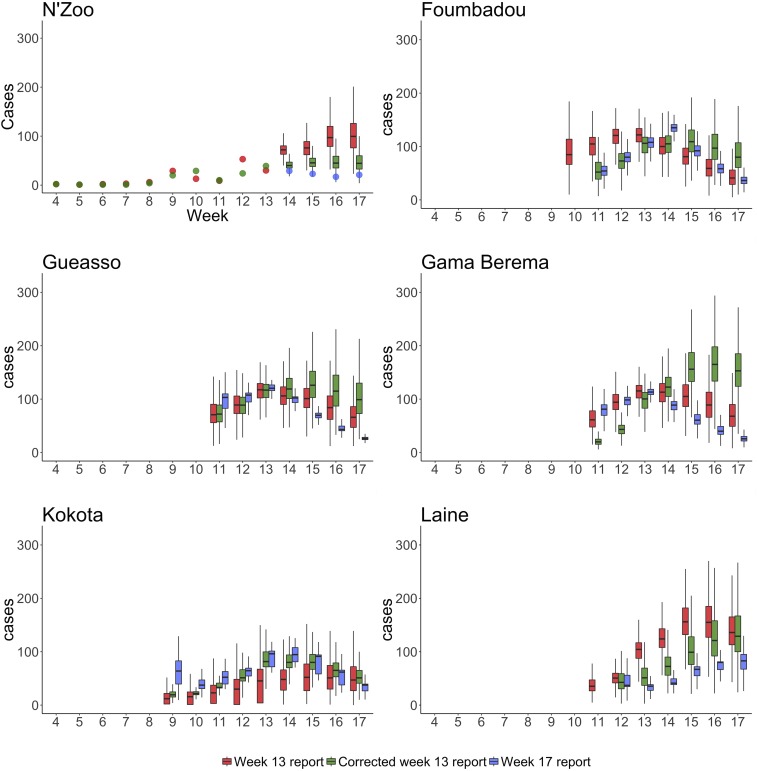
Figure 6.
Predictions of total cases in six subprefectures when R0 and a are allowed to vary. We plot the predictions made when using the Week 13 report in red, predictions from the corrected Week 13 report in green, and those from the Week 17 report in blue. For N’Zoo, we assume that the observed cases are equal to all cases; therefore, we plot the data from the Week 13 and Week 17 reports as dots. Because of the lack of data (see Figure 7), the estimates for Central Lola subprefecture were poor (because of non-converging Markov chain Monte Carlo chains) and so are not displayed here. Boxes represent the interquartile range and whiskers represent the 95% credible interval of posterior estimates. This figure appears in color at www.ajtmh.org.

