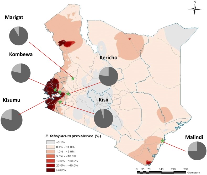
Figure 1.
Kenyan map showing the six field sites where parasites were collected. The pie chart shows the proportion of K13 mutations per site, light gray represents parasites carrying mutant alleles and dark gray the wild-type alleles. Map adapted with permission from Noor et al.49

