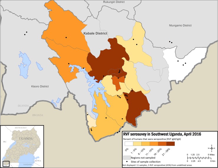
Fig 2. Map of Kabale district showing percent RVFV seropositivity for human samples by sub-county with less seropositivity in lighter colors and increasing seropositivity in darker color.
This figure was created specifically for this manuscript in ArcGIS using open source data from ESRI and DIVA-GIS for the background layers, and GPS points collected in the field for the points. (ESRI—http://opendata.arcgis.com/about, DIVA-GIS—http://www.diva-gis.org/).

