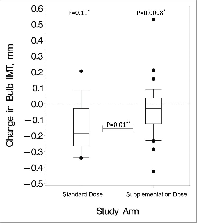
Figure 1.

Changes in carotid bulb IMT over the study period. These box and whisker plots show the distribution of changes after 24 months in the standard vs. supplementation arm for the HIV-infected subjects. Bottom and top edges of the box represent 25th and 75th percentiles, respectively, the center horizontal line is drawn at the median, and the bottom and top vertical lines (whiskers) extend to the 10th and 90th percentiles, respectively. Small circles outside of the vertical lines represent outlier data points. *P value for changes within group; **P value for differences in changes between the 2 dosing arms
